01 BLUF
The Bottom Line:
- Rebranded a newly merged public company end to end in one quarter, from identity through web, print, video, trade show, and product UI.
- Consolidated seven retired marks from the I.D. Systems and Pointer acquisitions into one brand with three product lines.
- Relaunched on NASDAQ as PWFL on October 3, 2019. The system ran every marketing and product surface until after my departure in 2022.
- Wrote the guidelines that let international subsidiaries apply the brand to their own materials and software without me.
02 My Role
Brand strategy, identity, brand guidelines, web, print and catalog, product and spec sheets, video (concept, edit, motion graphics, VO direction, audio post, 3D), trade show, product UI.
03 The Details
The Problem
I.D. Systems acquired Pointer Telocation in 2019, and the combined company needed a new name, a new mark, and a way to make two companies' worth of products look like one company by the day the deal closed. Between them the portfolio carried at least seven legacy marks (I.D. Systems, CarrierWeb, KeyTroller, VeriWise, Asset Intelligence, ReeferMate, Trailer Mate) plus Pointer and Cellocator, each with its own type, color, and collateral.
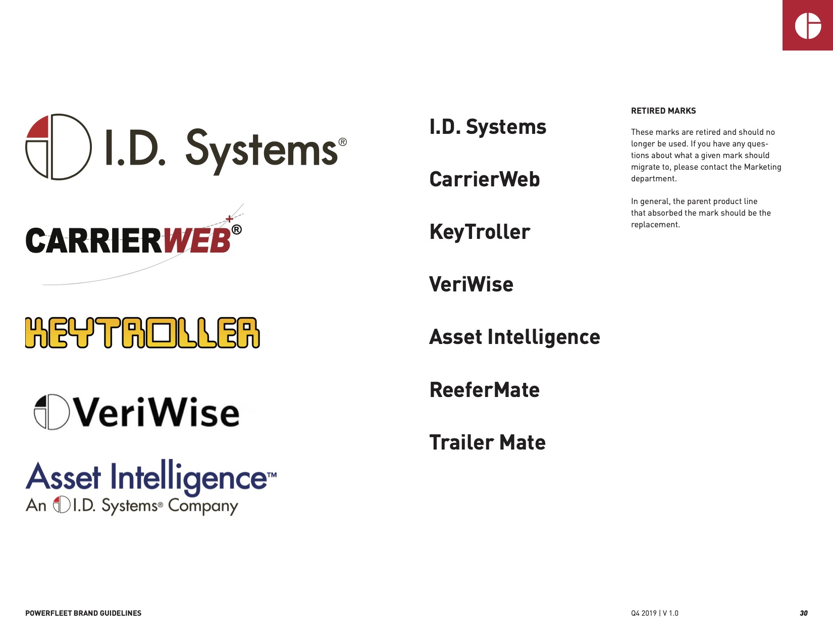
Seven marks to one.
The Mark
The new mark brings the I.D. Systems circle and the Pointer gradient together in a new, deeper red. The circle also reads as a “P” extracted from it. Product lines (Logistics, Industrial, Vehicles) sit under it as italic lockups. Pointer and Cellocator kept their own marks with a “by PowerFleet” endorsement; those brands had equity in their markets that wasn't worth spending.
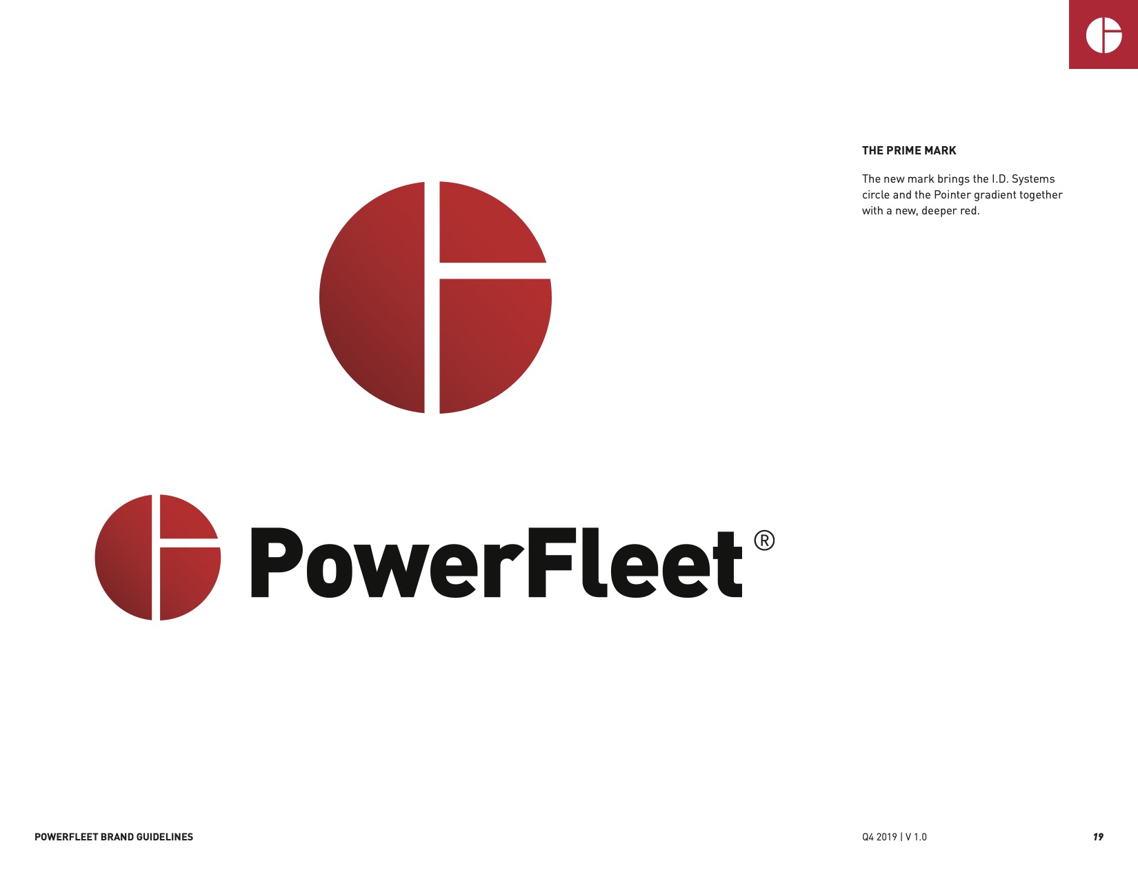
The mark's rationale, from the guidelines.
The System
The guidelines covered voice, color, type (DIN Pro, with Bahnschrift for Office and Reforma for Hebrew), the mark and lockups, photography, graphic elements, trademarks, email signatures, and LinkedIn. Two parts did most of the work.
The photo builder: a repeatable Photoshop recipe (desaturate, levels, a 186C vector shape at multiply, then again at 15 to 50 percent overlay) so anyone in marketing could produce on-brand imagery from stock without asking the design department.
The graphic elements: a set of data callout components in two styles that carried the brand from marketing into product UI, and became the seed of the platform work below.
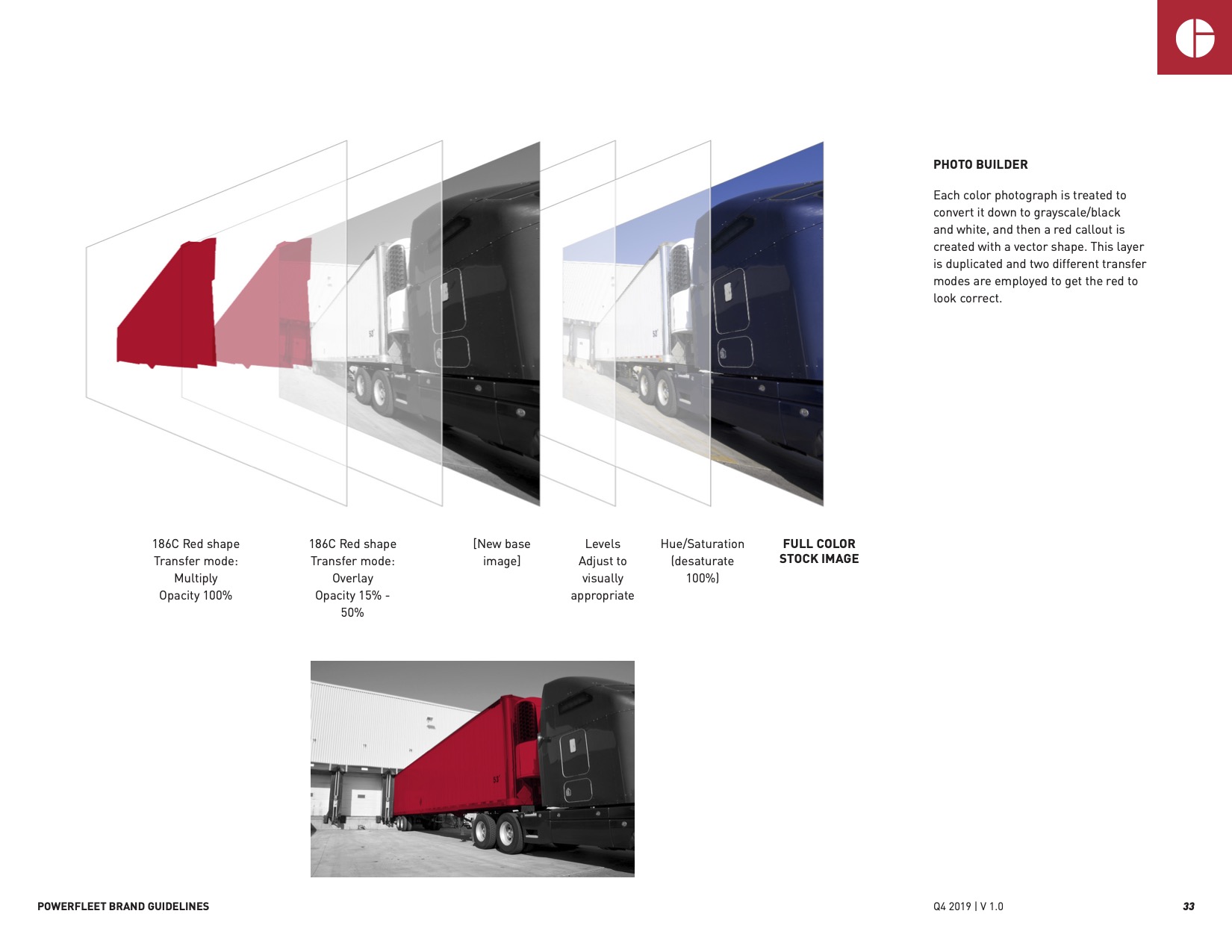
The photo recipe.
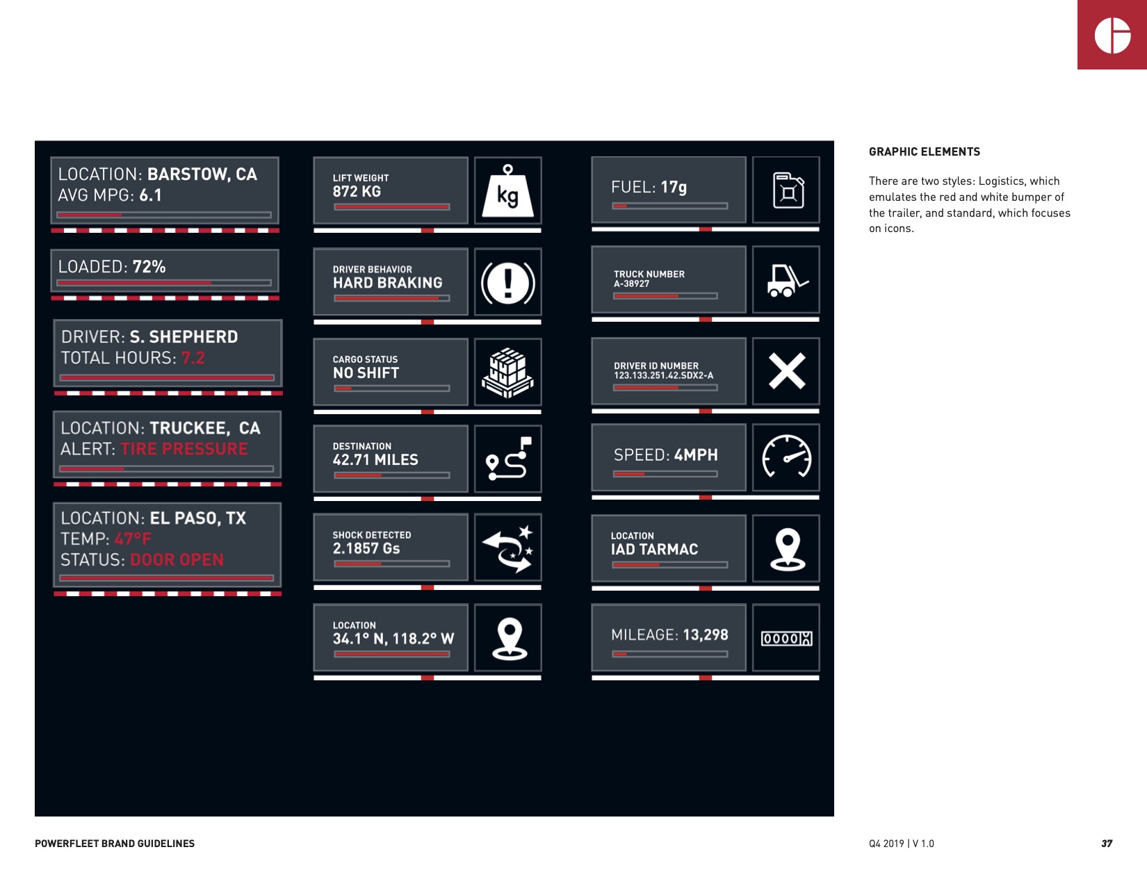
Data callouts. The bridge from brand to product.
Video
“Knowledge is PowerFleet,” a 60-second brand film for the relaunch. Concept, edit, motion graphics from the brand's graphic elements, VO casting and direction, audio post.
Knowledge is PowerFleet from Meticulous on Vimeo.
Collateral
Catalogs, two-sided product sheets, spec sheets, white papers, and trade show. The same components at every scale.
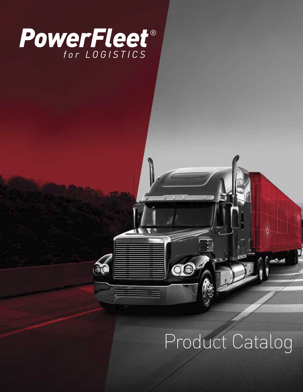
PowerFleet for Logistics catalog, Q1 2020.

The photo builder and the graphic elements in one spread.
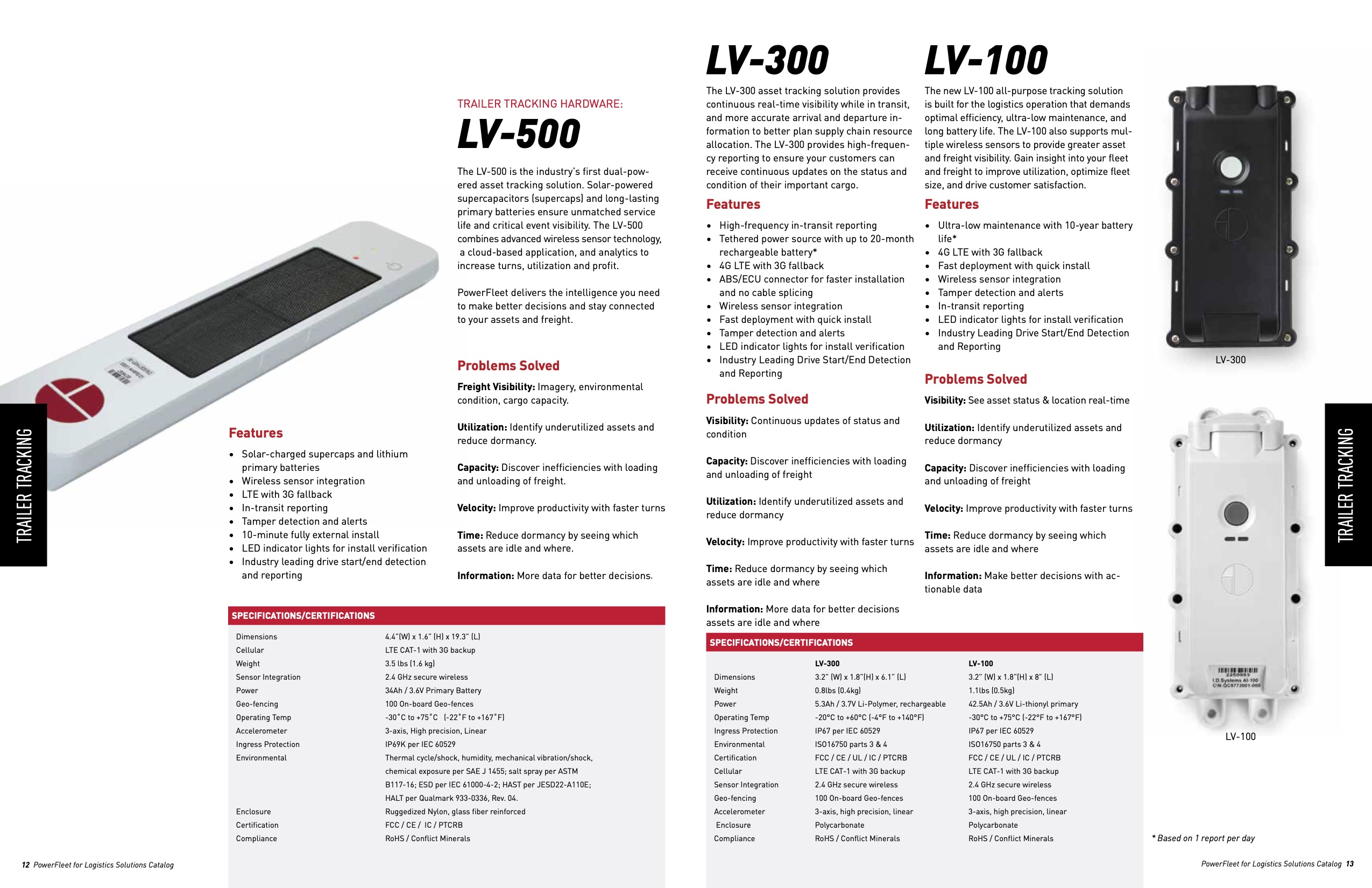
Hardware page, LV-500.

AT-100 product sheet, 2022. Same system, three years on.
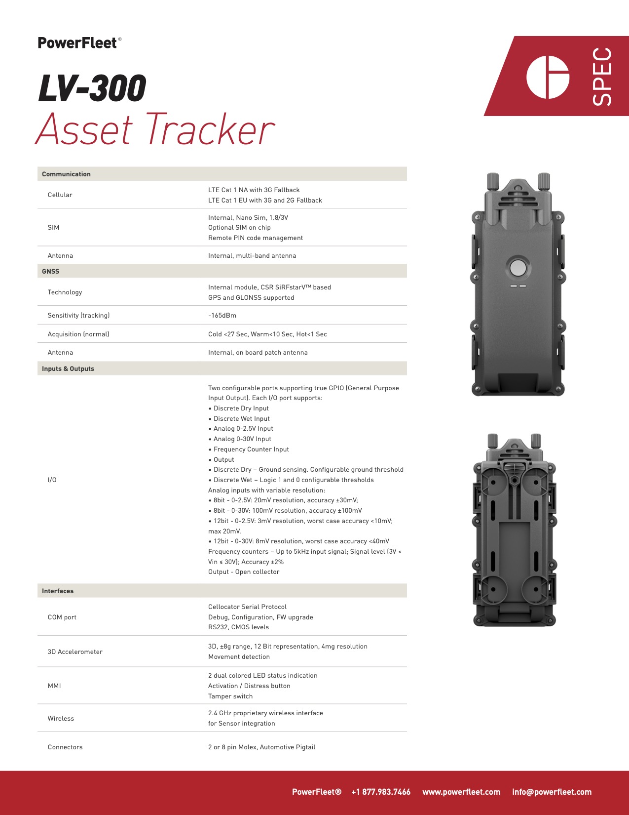
LV-300 spec sheet.
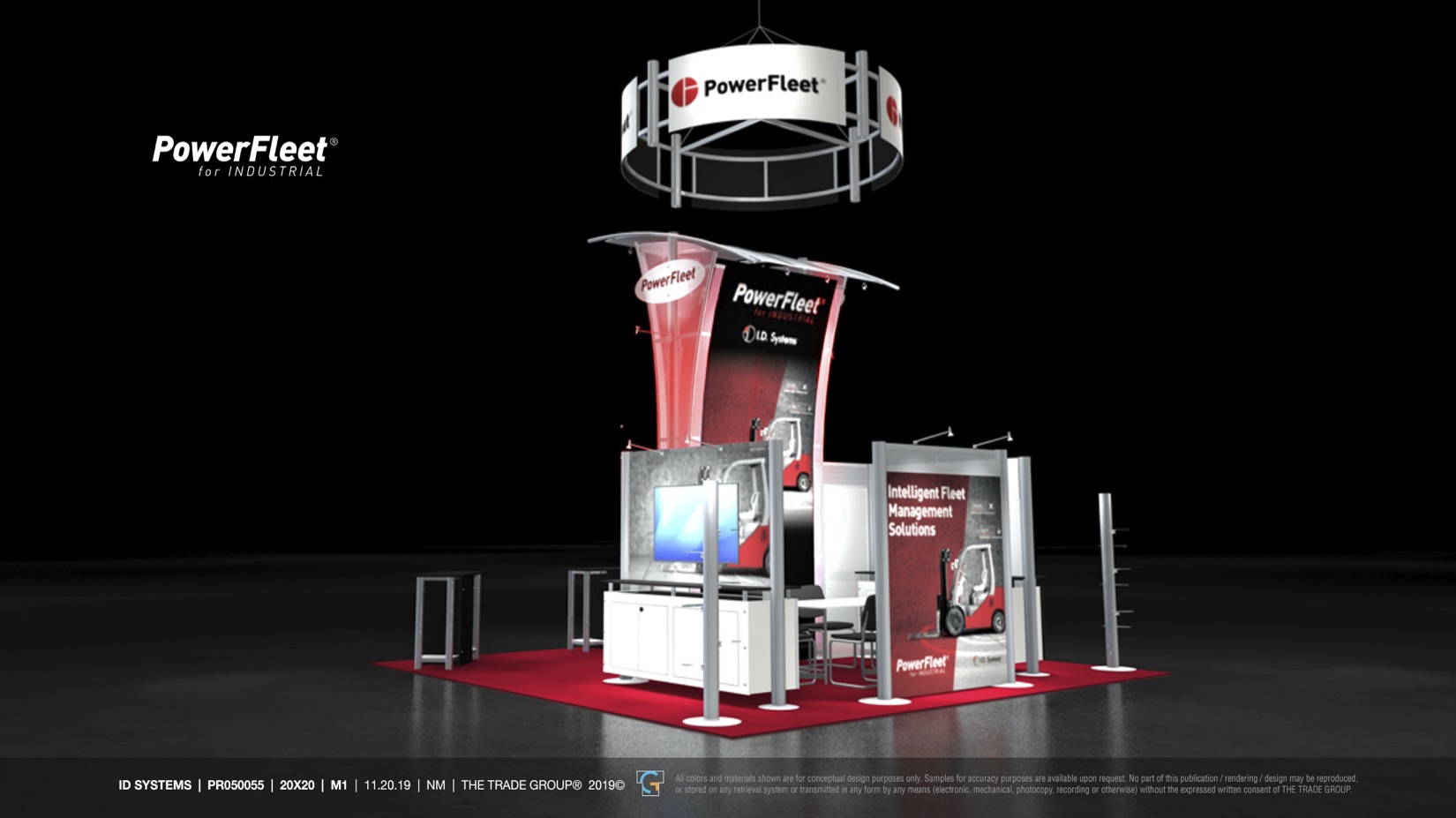
20x20 booth for the Industrial line, November 2019, inside the transition window the guidelines defined for the “by I.D. Systems” endorsement. Rendering by The Trade Group; concept, graphics, and brand application mine.
Product
The acquisition left at least five separately built products across divisions, and the brand had to reach into them or it wasn't a brand. I built the shared visual language through skinning and concept work, designing in Sketch and writing the HTML and CSS against engineering's React components myself, on variables throughout, before “tokens” was the word for it.
The first product I applied it to was the in-cab ELD, the LV-9000 driver terminal: an embedded device with a fixed display, a driver who can't be looking at it, and DOT rules about what has to be on screen. Brand type, color, and the graphic-element vocabulary, applied under constraints a marketing page never has. I designed and handed off the reskin to the ELD engineering team in 2020.
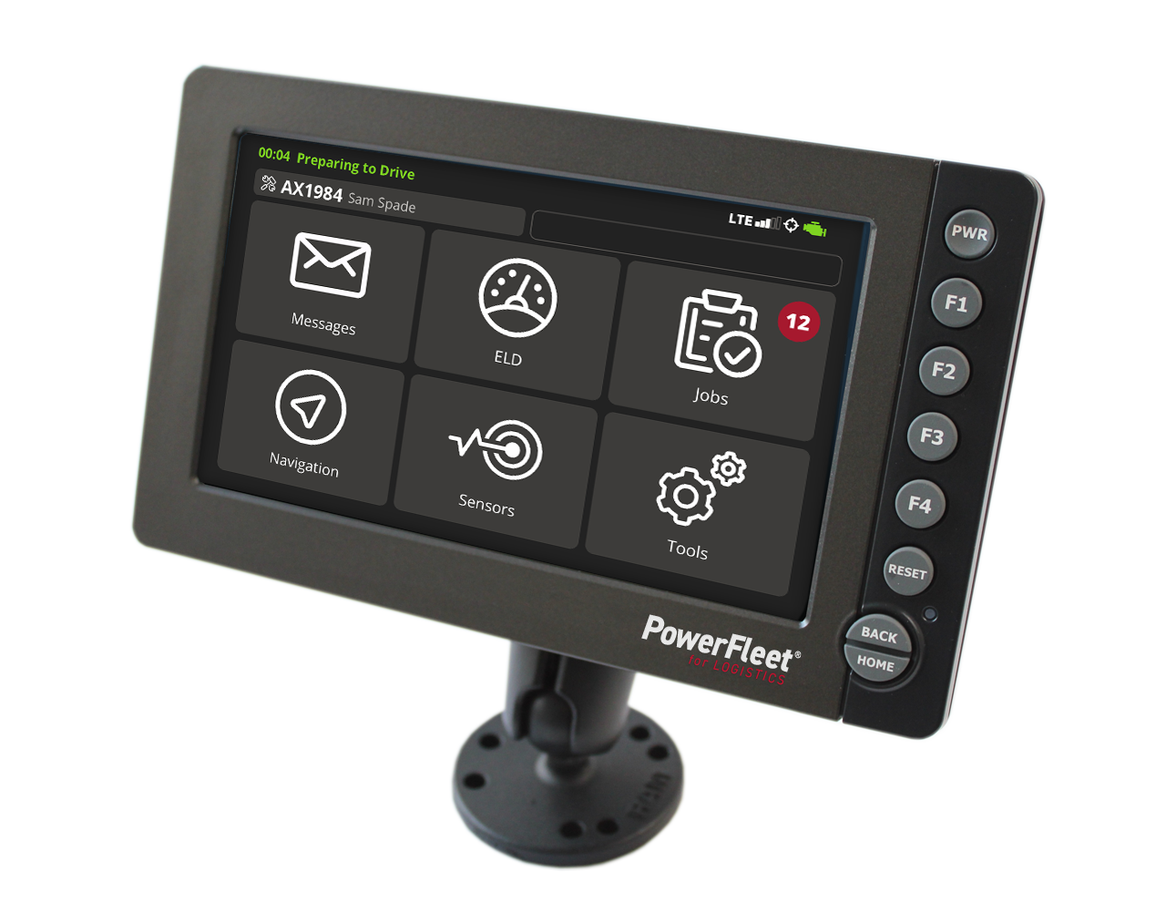
LV-9000 in-cab ELD, home screen. Brand type, color, and the callout vocabulary on a fixed embedded display.
The full Connect platform reskin didn't ship before the company's direction changed, but the language did: it became the Intermodal concept in 2021 and the basis for the Unity refresh in 2022.
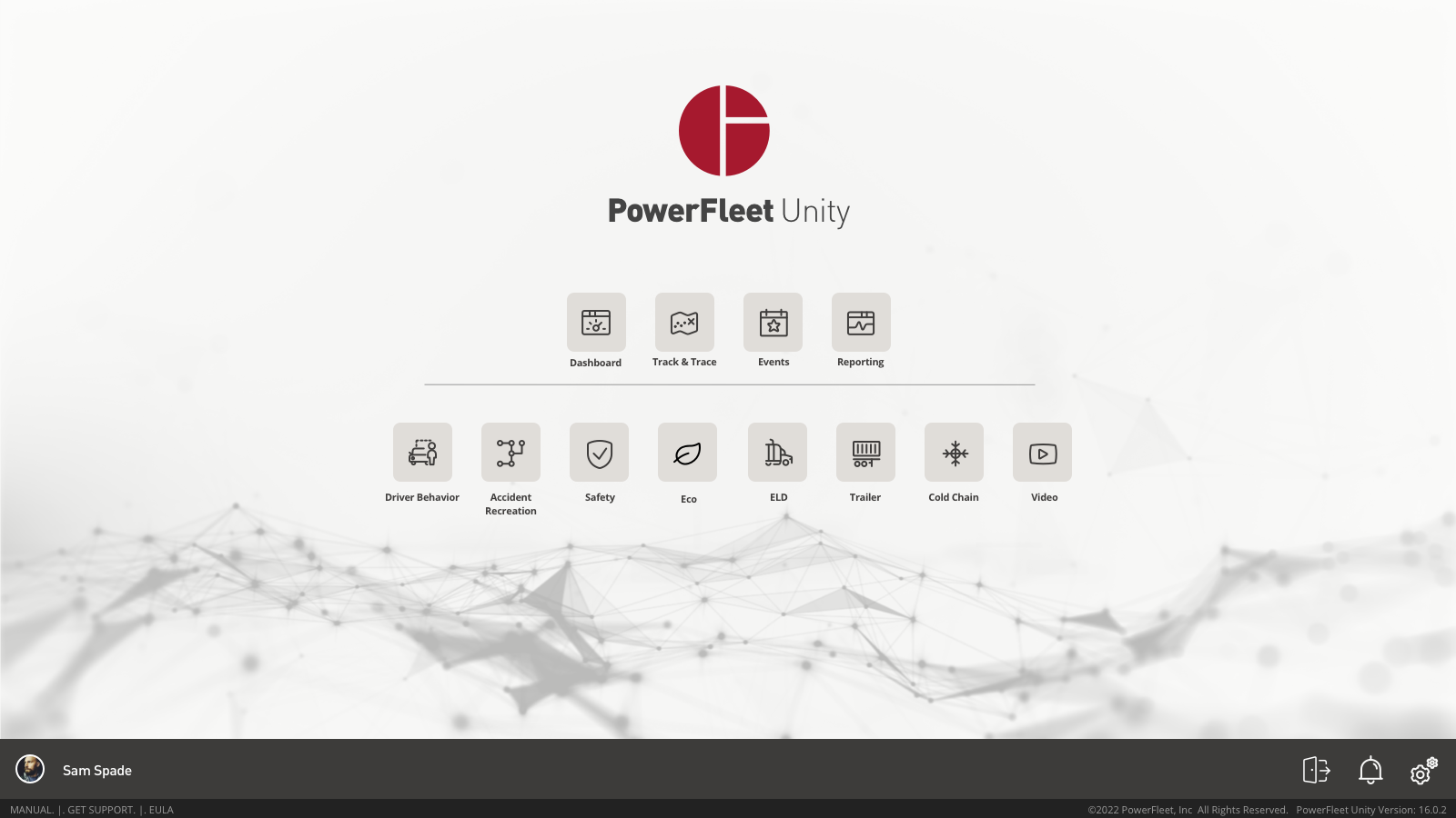
Launcher concept for the unified platform: one entry point across the products that came in through the acquisition.
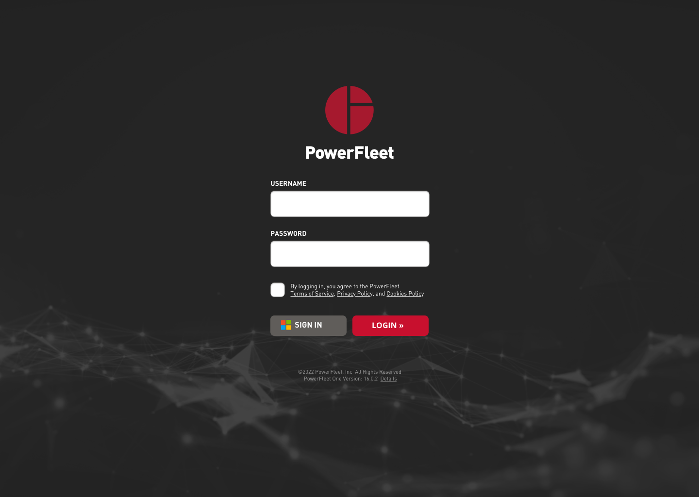
Login.
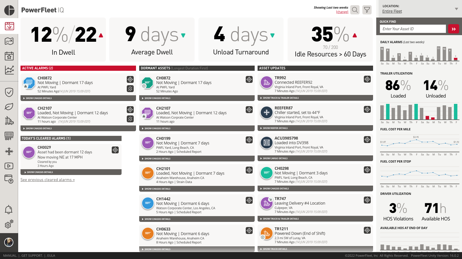
Dashboard concept.
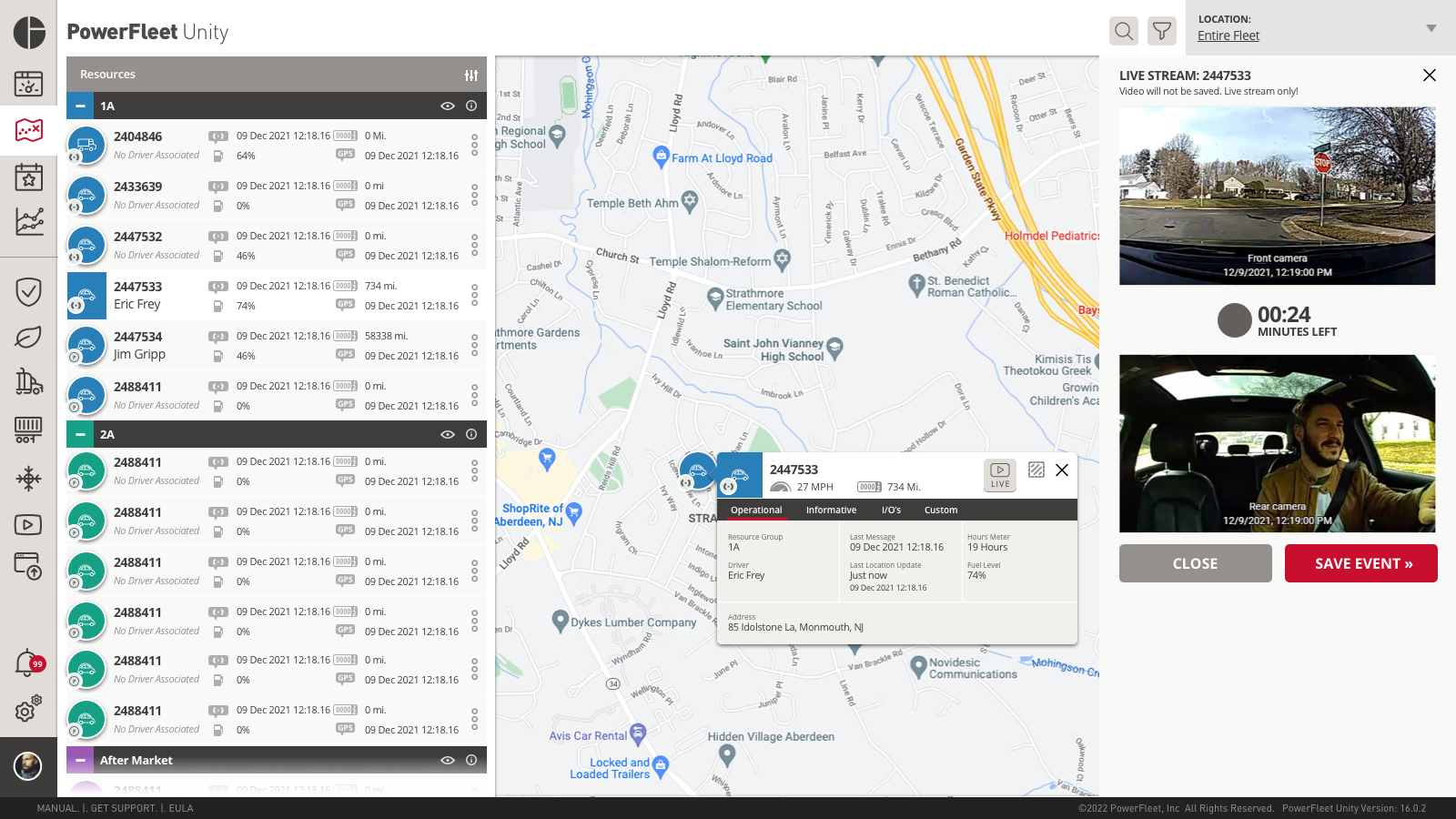
Track-and-trace with the in-cab camera feed in-line. Telematics and video designed as one surface.
- Relaunched on NASDAQ as PWFL, October 3, 2019.
- The system ran every marketing and product surface, in the US and in international subsidiaries, from the relaunch until after my departure in 2022.
- The graphic elements and visual language fed directly into the Intermodal concept (2021) and the Unity platform refresh (2022).